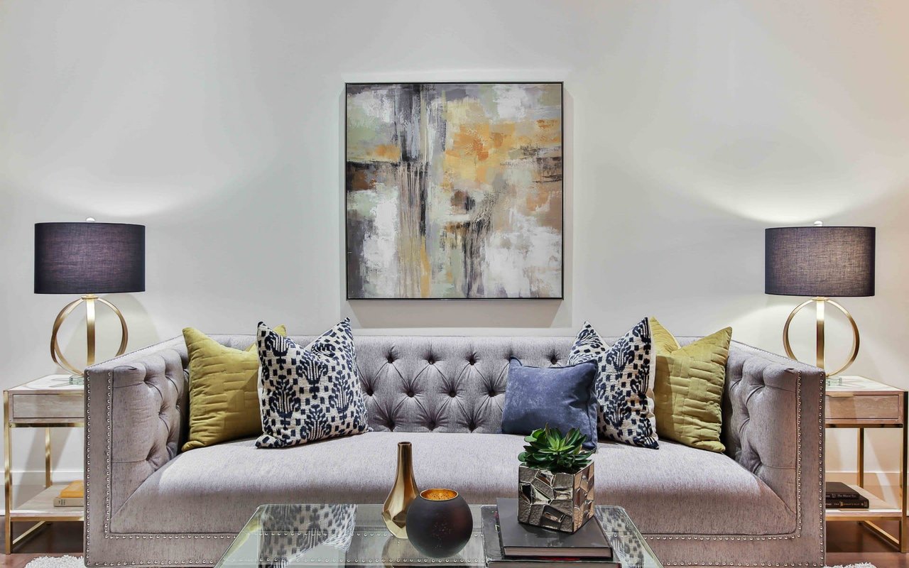
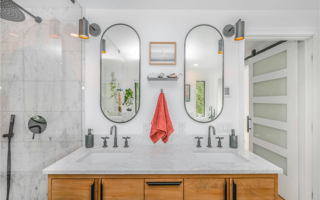
“Tired of living with white walls and the same decor that you’ve had for years? Want to spruce things up a bit, but not sure how, or where to start? Read these great tips from some of the best in the business.”
DC Metro Realty Team – Denise Buck & Ed Johnson
No rules – but timeless, unforgettable advice. Twelve designers share their favorite words of wisdom.
Don’t: Use White Decor If You Have Kids or Pets
“If you have pets or children, white rugs and upholstery are just not in the cards. People love the way they look but never realize that you have to hermetically seal your household to keep them clean.” –Markham Roberts
Do: Find Inspiration in Your Travels
“Travel as much as you can, and stay on the alert for inspiration wherever you go – you could find a great floor plan in a museum’s period room, or a color in a painting. And don’t just rely on your camera. If you draw something, you’ll really absorb the detail.” –DD Allen
Don’t: Forget About Seating
“Today everyone likes rooms sparse, but for a living room, you need the sorts of chairs people can pull up together, so that they want to come into the room and sit down and chat.” –Paula Perlini
Do: Use Dramatic Color in a Small Space
“Color is best used in small spaces that you pass through. A dramatic color in a room where you’re going to be spending a lot of time might feel too heavy or dark, but if you use it in a foyer or pantry, it makes the whole house feel colorful. It also makes the house feel bigger, because it turns a space you might not notice into one that catches your attention.” –John Barman
Don’t: Be Afraid to Splurge on Great Pieces
“Invest in one great-quality piece. It sometimes hurts in the beginning, but you end up having that piece forever, and it can really carry a room, or even an entire house.” –David Kaihoi
Do: Test Paint Colors in a Big Way
“When you test paint colors in a room, make big patches so that you can really see if you need to go darker or lighter. I make mine 3 feet by 3 feet.” –Mary Douglas Drysdale
Don’t: Ignore Architectural Details
“Respect the architecture of a space. That’s not to say you can’t be surprising – I might use period furniture in a modern room, but I’ll make sure the lines and silhouettes are appropriate. The whole room has to hang together.” –Mariette Himes Gomez
Do: Trust Your Instincts
“The late, great Antony Childs once said to me, ‘Be true to yourself, and trust your instincts.’ We all have different points of view – that’s what makes each of us special – and our rooms should be a reflection of that.” –David Mitchell
Don’t: Make a Room Too Formulaic
“Start a room with a classic furniture layout that’s functional, then add in funky pieces to loosen it up, relax it, and keep it from feeling too formulaic.” –Thom Filicia
Do: Draw the Eye With an Interesting Piece
“A photographer I worked with taught me the importance of the axial view. When you’re looking down a corridor, you want a wonderful object at the end of it to draw you forward – a sculpture, a chandelier, anything to define the space and pull you in.” –Nancy Braithwaite
Don’t: Go Overboard
“One of my mentors always said, ‘Just because you can doesn’t mean you should.’ Great projects are the ones that show a little restraint.” –Heather Hilliard
Do: Pay Attention to Doors and Entrances
“Spend the money to make openings between rooms as high as possible – anything to get away from the standard, squat 7-foot-tall door. It really creates a sense of openness, lightness, and grandeur in a space.” –Suzanne Lovell
Originally published on Yahoo! Shine


